Case study #3The One Where We A/B test to Simplify the Decisions of Guests
Selecting a hotel room should be an intuitive and seamless experience. However, when guests are presented with an overwhelming number of rates and pricing options, they often struggle to make a decision—leading to frustration and drop-offs. This phenomenon, known as paralysis by analysis, was a key challenge we identified in Amenitiz’s booking engine.
Our goal was to streamline the room selection process, guiding guests towards confident decisions while improving conversion rates.
Success Metrics
By implementing a new, structured two-step selection process, we achieved a 36% conversion rate from viewing rooms to adding products to the cart, reflecting a 12% increase over the previous design. 🚀
Problem Statement
After the redesign of Amenitiz’s booking engine, we noticed a significant drop-off at the Room Selection step. Hotjar analytics revealed that guests were frequently switching between the booking engine and the hotel’s website before finalizing their selection—suggesting that the presentation of information was not supporting their decision-making process.
Solution
We hypothesized that separating the selection process into two distinct steps would reduce cognitive load and better align with how guests make decisions:
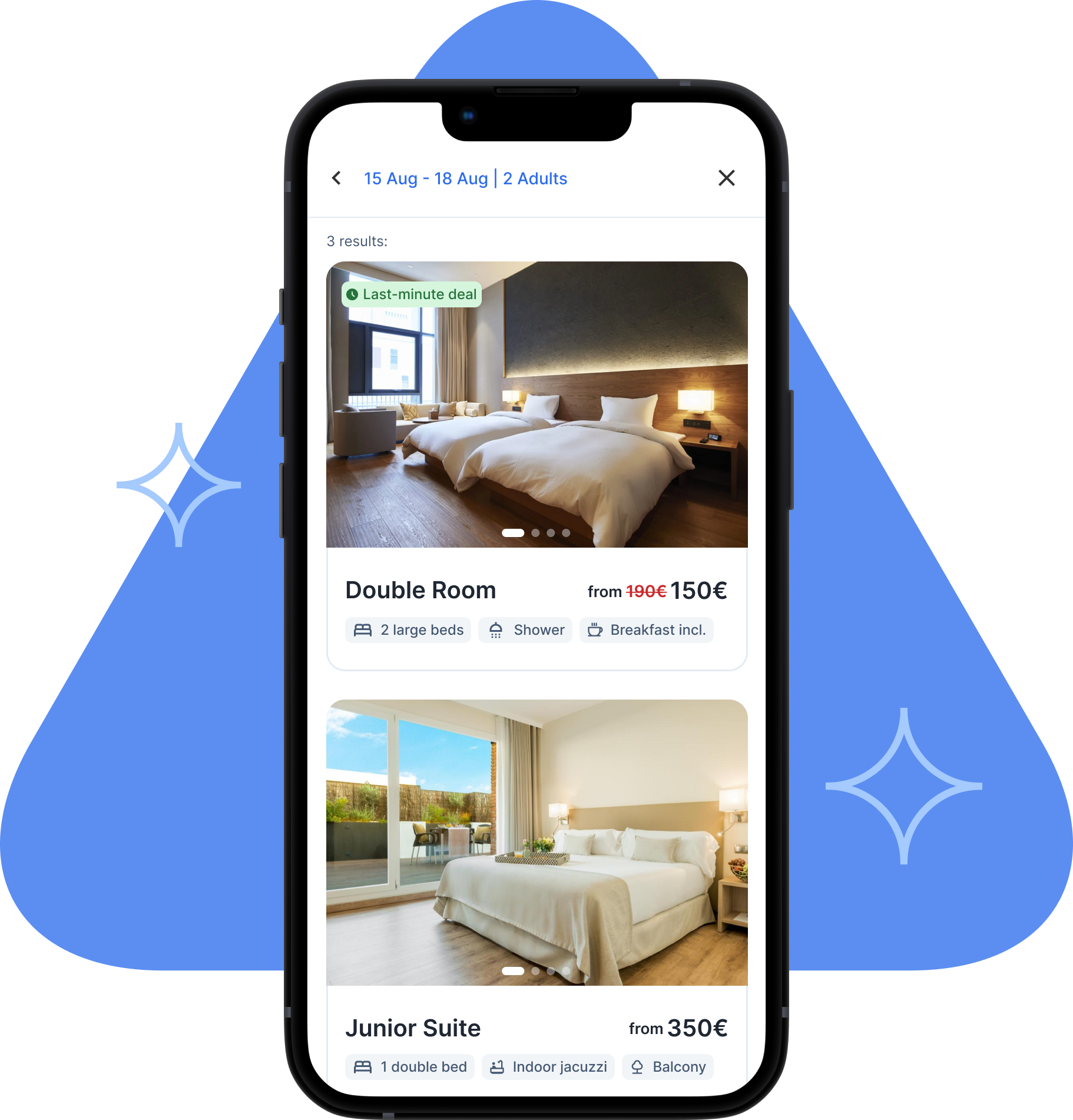
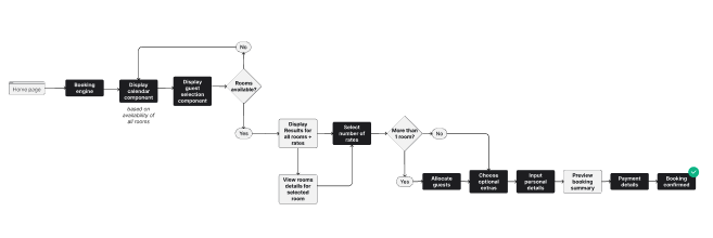
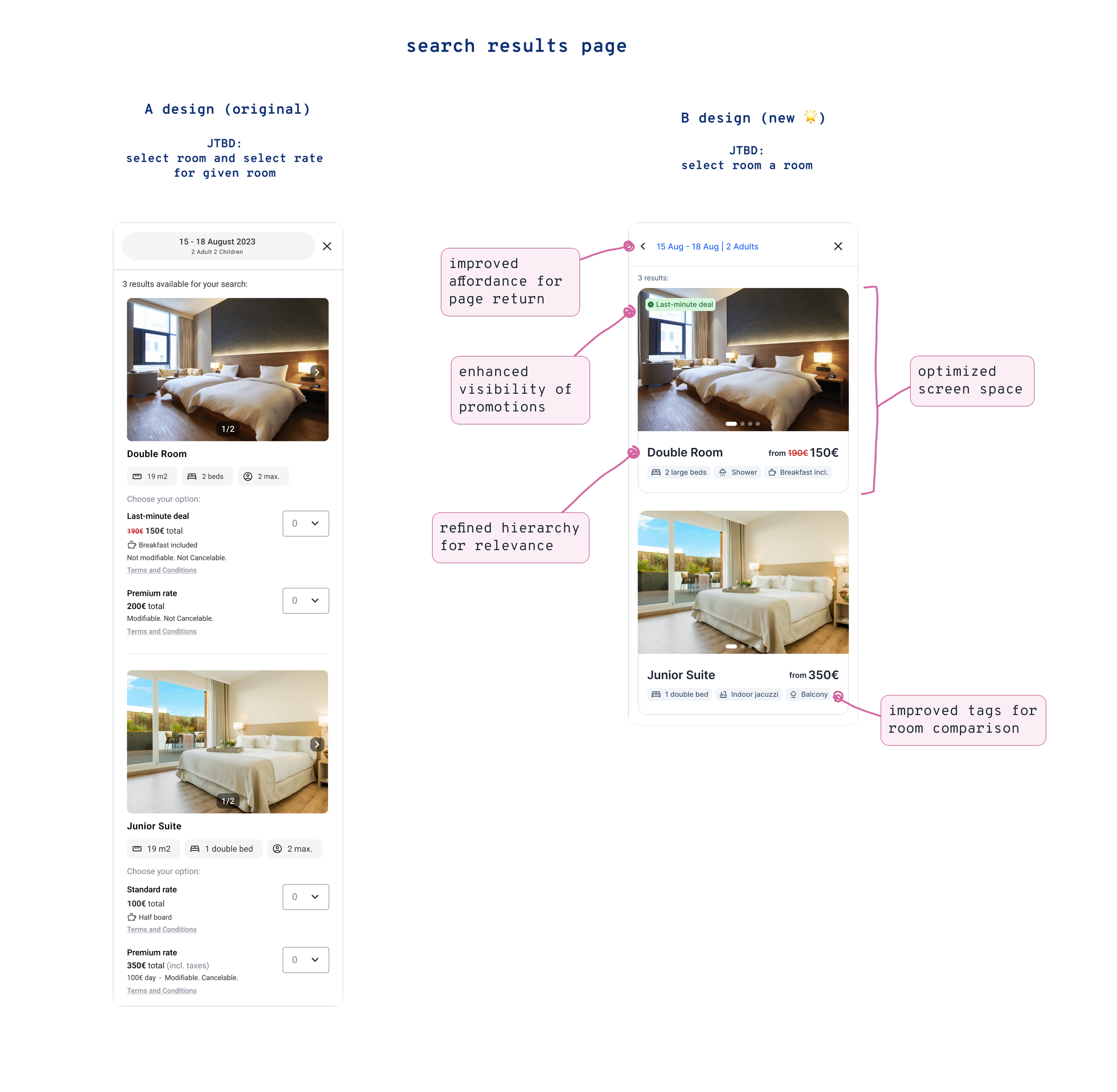
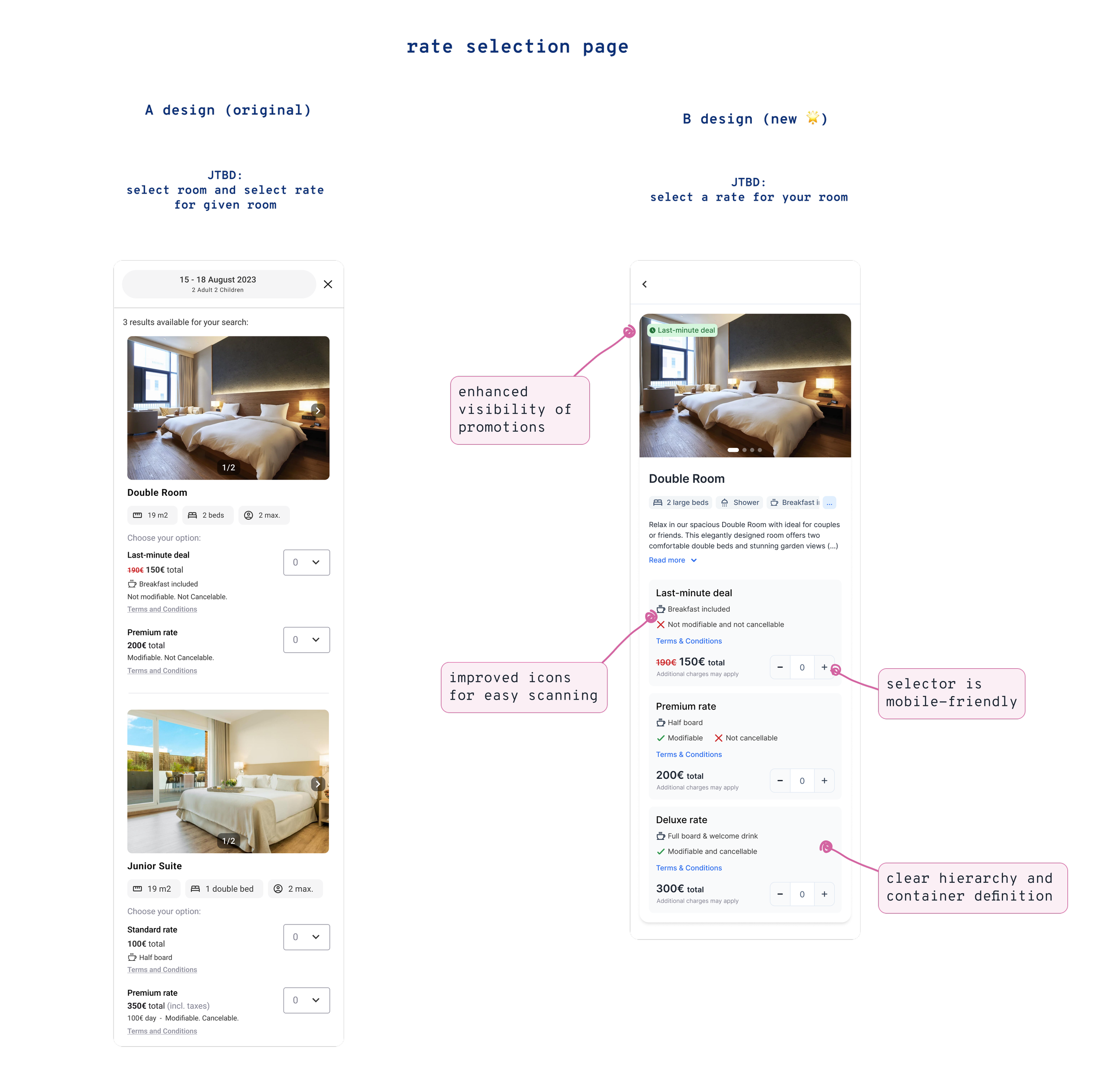
Room List Page → Displaying available rooms with their lowest price and key attributes.
Room Details Page → Providing all available rates and detailed room information only after a room is selected.
This approach mimicked natural decision-making patterns, prioritizing visual and functional appeal first, before introducing pricing considerations.
Process
ℹ️ Disclaimer: To maintain confidentiality some of the images have intentionally been left unreadable
1.Competitor Benchmarking 👀
To ensure our design aligned with industry best practices, we conducted a competitive analysis of both large-scale and niche hospitality platforms. Key takeaways:
Best-in-class platforms offered clear room details, transparent sales policies, and intuitive rate comparisons.
Smaller, innovative players emphasized high-quality visuals and simplified pricing structures.
Our design needed to balance clarity, flexibility, and upselling potential.
To enhance conversion rates, we focused on three fundamental UX principles:
Enhanced UX Flow: Guests intuitively assess rooms before evaluating pricing and policies.
Reduced Cognitive Load: Breaking the process into manageable steps avoids overwhelming users, especially on mobile.
Upselling Potential: Emphasizing room features first encourages guests to consider higher-tier pricing options once a room has been chosen.
2.Aligning the Flow with Guest Behaviour 🧠
3. Content Hierarchy & Visual Prioritization 📏
Our research highlighted that imagery played a pivotal role in decision-making. Client feedback reinforced this, emphasizing that room photos needed to take precedence over pricing tables.
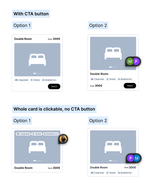
To address this, we redesigned the Room List and Room Details pages with a focus on:
Larger high-quality images to create an emotional connection.
A clearer content hierarchy that guided users logically from room selection to rate comparison.
A more intuitive call-to-action structure to drive conversions.
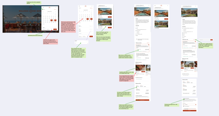
The redesign for the A/B test in depth 🔍
4. A/B Testing and Results 🧪
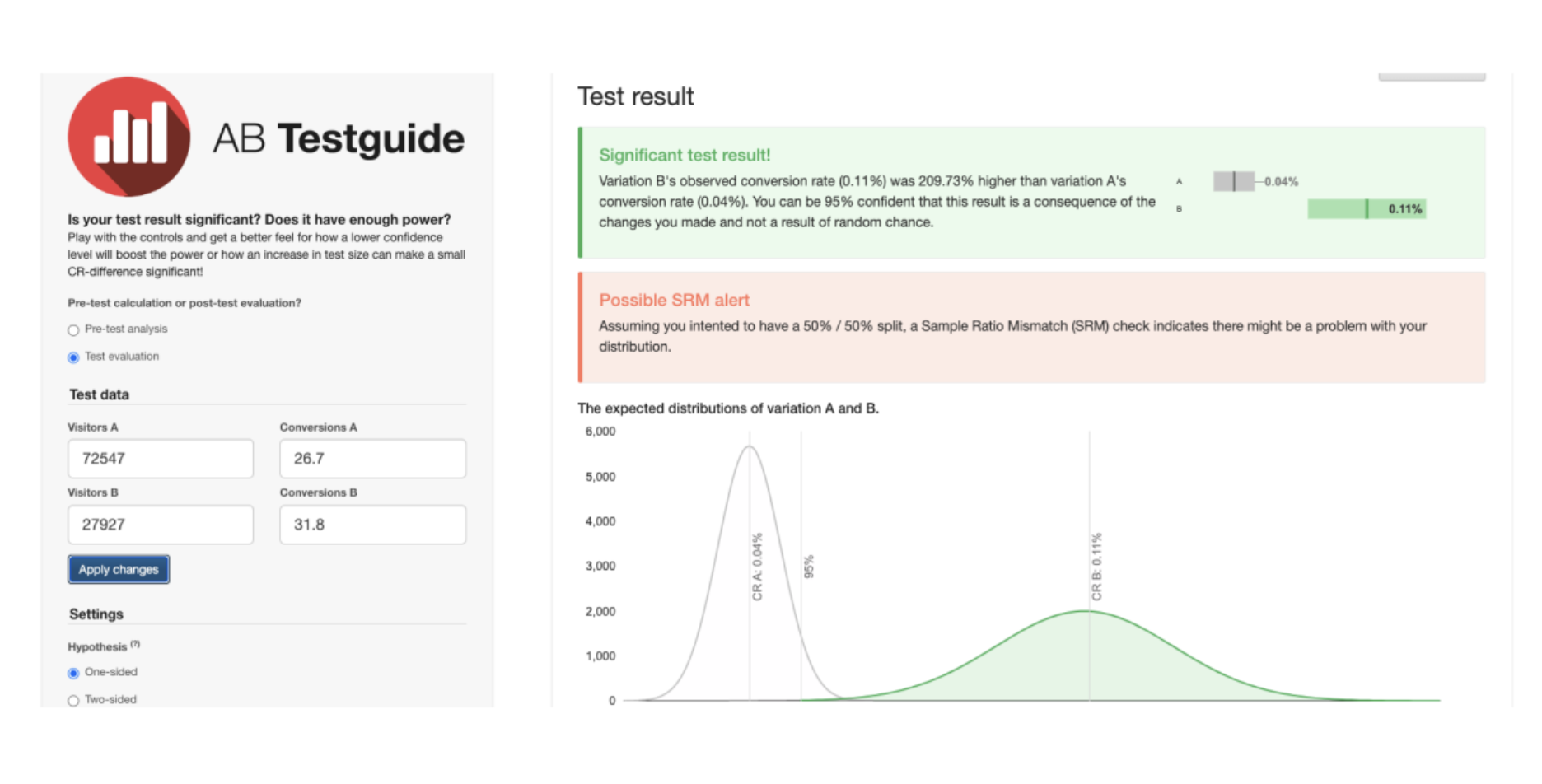
To validate our approach, we ran an A/B test comparing the new two-step design with the original version.
Key results:
60% of users successfully progressed from the Room List to the Room Details page, confirming the improved navigability.
37% increase in conversions for Property Managers, highlighting the value of structured decision-making for multi-property bookings.
25% increase in conversion rates for our ICP (Ideal Customer Profile), demonstrating that the improved UX resonated strongly with our target audience.
Next steps
1.Improving Data Collection and Experimentation 🔢
A major challenge in this project was the lack of a robust data collection system to track user behavior effectively. Given this limitation, we relied on A/B testing to validate our hypothesis. Moving forward, we will:
Advocate for investment in better analytics tools to track conversion behaviors.
Implement a more structured experimentation framework to continuously iterate on the booking experience.
Given the positive results, we plan to roll out the new two-step Room Selection flow across all properties, while refining adjacent areas of the booking experience to align with this improved structure.
2. Full Roll-out of the New Design ⚡️
Beyond this update, our findings suggest additional opportunities to refine:
Rate transparency: Simplifying how pricing and fees are presented.
Mobile-first optimizations: Ensuring the design scales effectively across devices.
Personalization opportunities: Exploring ways to tailor recommendations based on user behavior.
3. Expanding UX Enhancements 💼
Final Thoughts
This project was a great example of UX-driven problem solving, blending user research, data-driven decision-making, and iterative design. By aligning the flow with guest decision-making behavior, we delivered a simpler, more intuitive experience that resulted in significant conversion improvements.
With a strong foundation in place, we are excited to further optimize the booking experience and drive even greater value for both guests and property managers.